Since I learnt HTML/CSS, I wanted to create my homepage that I can use as the default page for my browser. I just don’t like most of the homepage extensions that are out there. Many collect your data, or they are just too slow and don’t look good.
I had 2 options to deal with that, either I could load the page from my local machine which would give it lighting quick loading times, or I can upload it to something like Github, or Cloudflare pages. Both options were fine for me.
I wanted something simple but at the same time, something so different that no one else had created.
So I settled for a few things that I wanted on my page.
- A clock
- A message with an image
- And a search bar
Clock
I always liked apple’s screensaver clock. It has the mechanical feel to it and is big. I didn’t care too much about the mechanical look, but I did want something big. But as I was adding other elements like images, message and a search bar, I was limited with the size of it.
I also added seconds counter to make it seem moving and alive.

Message
I wanted a personal message, I settled for good morning/afternoon/evening. Something simple that I can change if I want in the next iteration. Or I can load random messages every time if needed, but for now it’s simple.

I also added our very own menhera chan as the mascot of the page. The images change according to the time of the day. and I can make them change every hour if I really want it to.
Search Bar
I was using neeva search when I first made this, but as neeva is shutting down I switched to duckduckgo as my search bar.
The keen eyed amongst you will see that the search button also changes colors in sync with the background. In the beginning I had made a simple button with one color but, it just looks better when the color is changing with the background so settled for it.

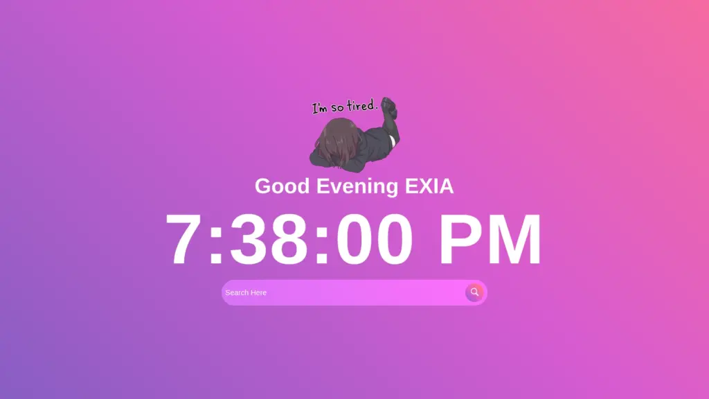
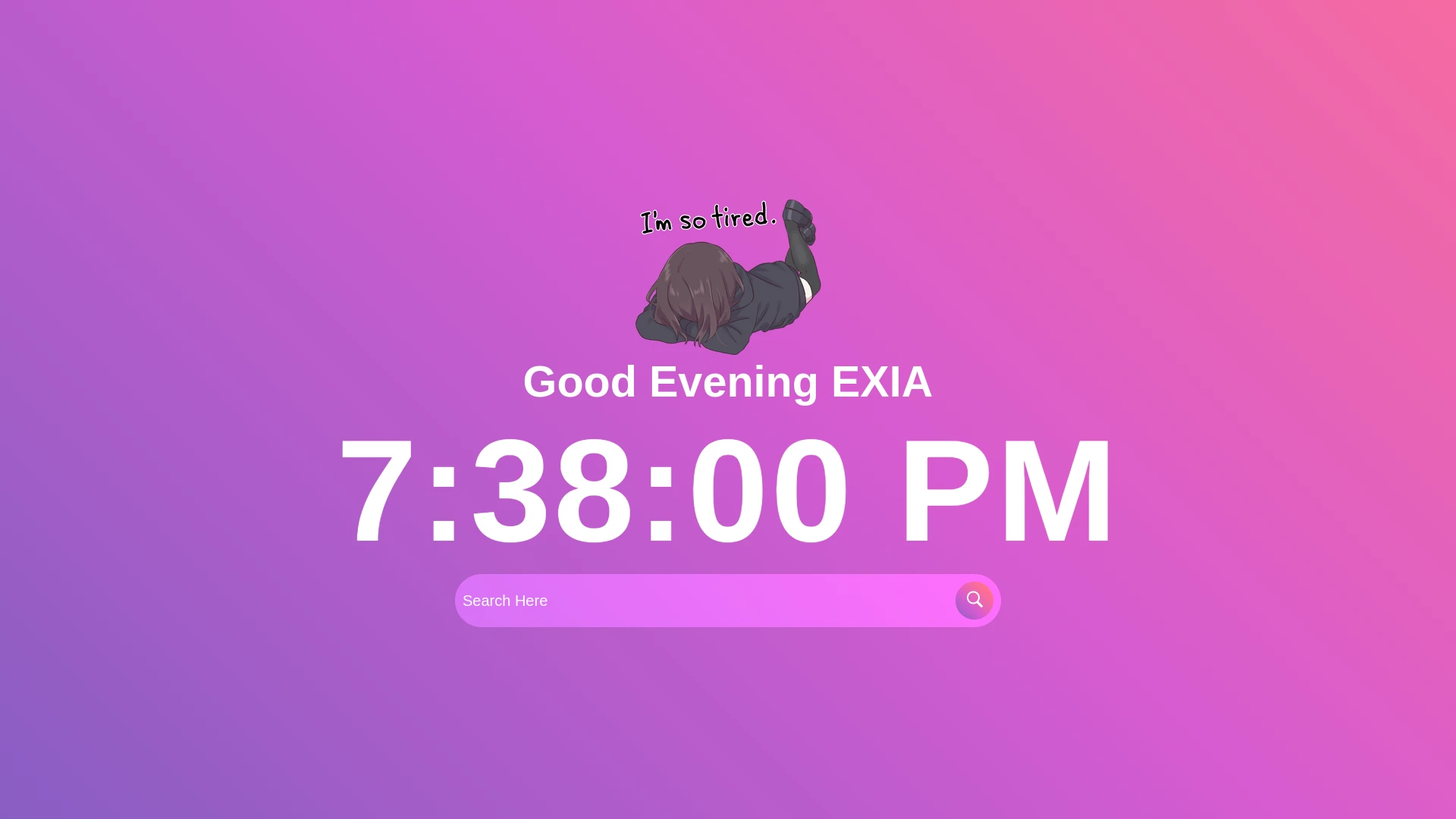
This is How It Looks

Simple and somewhat cute, but at the same time functional. The best part about is that you can see the background colors shifting slowly and that’s the only thing that makes this page stand out from others.
You can check out the live page that I uploaded on cloudflare pages. The whole thing is very light. The project size is 83kB, with all the images. So when you have the page open and it just has one image that’s way smaller. I’m happy with it for now, might add more functionality in the future.
Here’s the Code
HTML
<!DOCTYPE html>
<html lang="en">
<head>
    <meta charset="UTF-8">
    <meta http-equiv="X-UA-Compatible" content="IE=edge">
    <meta name="viewport" content="width=device-width, initial-scale=1.0">
    <link rel="stylesheet" href="style.css">
    <link rel="icon" type="image/x-icon" href="/mnt/66B67245B6721631/backup/Projects/Random Projects/Personal Web Homepage/favicon.ico">
    <title>H O M E P A G E</title>
</head>
<body>
    <div class="bg-img">
        <div id="hello"></div>
        <h1 id="time"></h1>
        <form action="https://duckduckgo.com/?q=" class="search-bar">
            <input type="text" placeholder="Search Here" name="q">
            <button type="submit">
                <img src="/mnt/66B67245B6721631/backup/Projects/Random Projects/Personal Web Homepage/icons8-search.svg">
            </button>
        </form>
    </div>
    <script src="main.js">
    </script>
</body>
</html>
CSS
*{
    margin: 0;
    padding: 0;
    font-family: Arial, Helvetica, sans-serif;
}
:root {
    --color: linear-gradient(
        45deg,
        #845ec2,
        #d65bd1,
        #ff6f91,
        #ff9671,
        #ffc75f,
        #f9f871
    );
}
.bg-img{
    display: flex;
    flex-direction: column;
    align-items: center;
    justify-content: center;
    background-image: var(--color);
    background-size: 400%;
    min-height: 100vh;
    animation: bg-ani 30s infinite alternate;
}
@keyframes bg-ani{
    0% {
        background-position: left;
    }
    100% {
        background-position: right;
    }
}
.bg-img h1{
    color: white;
    font-size: 10vw;
    font-weight: bold;
    letter-spacing: 3px;
}
.search-bar{
    width: 90%;
    max-width: 700px;
    background: rgba(255,255,255, 0.2);
    display: flex;
    align-items: center;
    border-radius: 5rem;
    padding: 10px 10px;
    backdrop-filter: blur(4px) saturate(150%);
}
.search-bar input{
    background: transparent;
    flex: 1;
    border: 0;
    outline: none;
    padding: 10px 0;
    font-size: 20px;
    color: #ffffff;
}
::placeholder{
    color: #ffffff;
}
.search-bar button img{
    width: 25px;
}
.search-bar button{
    border: 0;
    border-radius: 50%;
    width: 50px;
    height: 50px;
    cursor: pointer;

    background-image: var(--color);
    background-size: 300%;
    animation: bg-ani 30s infinite alternate;
}
#hello{
    display: flex;
    flex-direction: column;
    align-items: center;
    justify-content: center;
    text-align: center;
}
#hello img{
    display: block;
    margin: auto;
    max-height: 20vh;
}
#hello h2{
    color: white;
    font-size: 3vw;
}
JavaScript
let time = document.getElementById("time");
setInterval(() =>{
    let b = new Date();
    time.innerHTML = b.toLocaleTimeString();
},1000)

var myDate = new Date();
var hrs = myDate.getHours();

var greet;

if (hrs < 4)
    greet = ' <img src="/sleep-menhera-chan.png"/><h2>Good Night EXIA</h2>';
else if (hrs >= 4 && hrs <= 12)
    greet = ' <img src="/8841-menhera-morning2.png"/><h2>Good Morning EXIA</h2>';
else if (hrs >= 12 && hrs <= 17)
    greet = ' <img src="/5271-menhera-chillout.png"/><h2>Good Afternoon EXIA</h2>';
else if (hrs >= 17 && hrs <= 24)
    greet = '<img src="/1370-menhera-tired.png"/><h2>Good Evening EXIA</h2>';

document.getElementById('hello').innerHTML =
    '<b>' + greet + '</b>';
